
The AFL Years
- Tom Jacobsen

- Jan 9, 2025
- 3 min read
The Denver Broncos are one of the premier franchises in the NFL, having won multiple Super Bowls and having one of the, if not the, most passionate fan bases in the league. However, at their beginning in 1960, they were just hoping to survive from one year to the next.
There are many stories about those first few years: The open tryouts, the revolving rosters, the potential moves to other cities. But, as our site is dedicated to the team’s uniforms, this post will focus on the five different uniform styles they wore during the AFL years of 1960 - 1969.
Version 1: 1960-1961
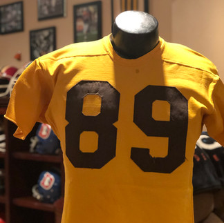
The first uniforms were previously worn in a college all-star game in the late 50’s and were provided by the team’s first General Manager Dean Griffin. If today’s Broncos fans could go back in time and sit in the stands for a game in the stands they’d have no idea which team was the Broncos based on the look of the uniforms alone.
The colors were yellow and brown and they wore the infamous vertically striped socks. Their helmets were brown with white numbers on the side.


Version 2: 1962-1964
“Something new in ‘62” was the marketing slogan for 1962. Coach Jack Faulkner brought in a new look for the team with a new color scheme. This was the first step toward the now beloved orange and blue look that fans appreciate so much. However, in this version, the orange was more of a burnt orange and the helmets were orange with a white bucking cartoon horse. For a brief period at the beginning of 1962, the horse decal was blue, however this did not show up well on the black and white TV of the day so they changed the horse to white. Here is Ring of Famer Frank Tripucka’s game worn jersey and Goose Gonsoulin’s helmet from that era.


Version 3: 1965-1966
The third uniform iteration was a big change from the previous two combinations. The helmet design stayed close to the 1962-1964 version with a change of the shape of the horses eye to a star in 1965 and then the addition of a blue outline around the horse and a blue center strip with white stripes on both sides in 1966. The jerseys when to a more reddish orange color and added a color stripe to the sleeves where the TV numbers were placed. Here is an example of both a home and road game worn jersey from this version as well as a game worn helmet (note the center stripes were pulled off years ago).


Version 4: 1967-1968
The next drastic change to the uniforms created a version that would last until the next big change in 1997. This version is the classic Denver Broncos look that most fans recognize. The helmets in 1967 were blue with no decals on the sides and a single white stripe down the middle. The classic Broncos D logo debuted on the 1968 helmets. The jersey color, while still a reddish orange, was closer to the classic Orange Crush era color. Unique to these two years is the skinny font used on for the front and back numbers and the TV numbers on the sleeves. Here is an example of both a home and road game worn jersey and also a helmet from this era.


Version 5: 1969
The change from version four to version five was subtle. The material used for the numbers switched from a tackle twill (fabric) to a thick, rubber/vinyl material. The size of the font used also increased by quite a bit. The color scheme and helmet design stayed the same. Here is an example of both a home and road game worn jersey and also a helmet from this year.


Each of the first four iterations of the team’s uniforms during the AFL era were so drastically different that you would have thought four completely different teams were playing during those years. In 1967, the team not only found their stride with the city by mustering enough fan support to stop a move to Atlanta, they also found their stride with the uniforms they were wearing on the field.


Comments